
40 Amazing Reporting Projects You Might Have Missed
by Josh Stearns and Luis Gomez

Every year storytelling and journalism on the web gets better. For the past three years I have rounded up the most compelling examples of reporting online (here is 2014, 2013, and 2012). This year I had the good fortune to collaborate with Luis Gomez on this project.
This is a labor of love. Our hope is that by shining a spotlight on this important work, we can help you discover things you might have missed and that you’ll share them and support the journalists who made them possible.
There is no formal criteria for what makes the list. We tried to focus on stories that leverage the unique potential of the web, stories that come to life on the web in ways they never could have otherwise. But we also look for stories that — while not technically groundbreaking — still hit us in the gut and stick with us.
Sometimes it is about using the right tools for the story, not every tool in the toolbox.
We know we’ve likely missed amazing pieces that deserve to be recognized — which is why we ask you to add yours to the comments here. And if you like these stories, sign up for the weekly Local Fix newsletter for more case studies on innovation and community engagement in journalism.
RACE
#BlackLivesMatter has helped fuel renewed attention to issues of race and justice in media. The following projects reflect that but it is worth also recognizing the way #BlackLivesMatter has used creative storytelling and social media to report on these issues when others wouldn’t. That is also online journalism and should be included here. 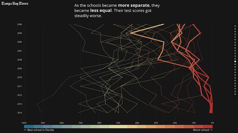
“Failure Factories” — Tampa Bay Times
Failure Factories tells the story of the end of integration at the Pinellas County School District in Florida. To tell this investigative multi-story series, the Tampa Bay Times visualizes data to illustrate the impact of desegregation in some of the poorest neighborhoods in the district. The opening prologue is simple, but powerful and effective.
The 45 Minute Mystery of Freddie Gray’s Death — Baltimore Sun
One of the biggest stories that set the tone for race and justice conversations in the media was the death of Freddie Gray while in the custody of Baltimore’s police. The challenge of telling the story, which started out as a local story and later evolved into a national story, is sorting out much of what happened in the minutes and hours before and after Gray’s death. The Baltimore Sun zeroes in on those moments with compelling video and details often not visible from a bird’s eye view.
#InTheirWords — USA Today
In writing about USA Today’s #InTheirWords project the American Journalism Review wrote that “one way to tell the stories about race [is] to remove the journalists.” Of course USA Today did not remove journalism from this piece but they did change the relationship between journalist, reader and subject. The audience can create a self-driven documentary drawing on a set of interviews with young leaders in the civil rights organizing. The project is similar to the Washington Post’s 2014 N-Word project.
SCIENCE AND ENVIRONMENT
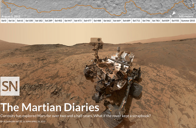
The Martian Diaries — Science News
If the Mars Rover kept a diary, what would it look like? That is the question designers and journalists at Science News set out to answer in this great piece which draws on two and half years of photos and data from the exploration of Mars.
After the Storm — Washington Post, Independent Lens and other partners
Blurring the line between journalism and documentary film, this partnership between the Washington Post and PBS’s Independent Lens is described in the opening seconds as a “letter to future disaster survivors.” With narration, looping music and an aesthetic like a scrapbook with maps, photos and snippets of text the piece is like sitting down across from someone and listening to them tell you their story.
Primer Stories — Joe Alterio and Tim Lillis
Primer Stories is a collection of unique stories, many though not all focus on science. Alterio and Lillis invite authors to contribute short pieces and then use GIFs, illustrations, videos, and photos to bring them to life. The results feel like a kind of bespoke journalism, each one creatively and lovingly designed in ways that add richness and meaning. See for example Dragons of the Alps, You Are Here, On Ice and How to Build a Brain. (Hat tip @MollydeAguiar for this one)
Every Active Satellite Orbiting Earth — Quartz
When the Union of Concerned Scientists released a database of the 1,300 satellites currently in orbit over earth, Quartz took the data and created a visualization. Organized by size of the satellite and the country it belongs to, this interactive graphic give us a glimpse of each satellite’s launch date, users, and owners.
Greenland is Melting Away — New York Times
The New York Times used a drone to bring readers high above the melting glaciers of Greenland in this beautiful piece that was published the month before the UN climate talks in Paris. The drone footage is accompanied by scroll-to-zoom aerial imagery and data that maps of all the glacial rivers including flow rates. (See also After Years of Drought, Wildfires Rage in California from New York Times)
Japan’s New Satellite Captures an Image of Earth Every 10 Minutes — The New York Times
The graphic presents a view of the globe, in the Times words, “as a massive organic system, pulsing with continuous movement.” It is hypnotic.
VIRTUAL REALITY

It is impossible to talk about online storytelling in 2015 without talking about the rise of virtual reality. While not a technology that was invented or pioneered in 2015, last year did mark a tipping point in the adoption of virtual reality inside newsrooms. This was perhaps most evident in the Google Cardboard/New York Times partnership in which every New York Times subscriber recieved a virtual reality viewer with their Sunday paper.
Those who are experimenting with journalism and virtual reality have set up good pages that collect all their reporting in one place. Check out the stories and apps from journalists at ABC, Vice and the New York Times, media organizations like Discovery and KCRW, and local news companies like Gannett and Digital First. On the university side, see projects by Robert Hernandez, Nonny de la Peña, the University of Arizona, and Dan Pacheco. (See more stories at the VRSE website)
IMMIGRATION AND REFUGEES
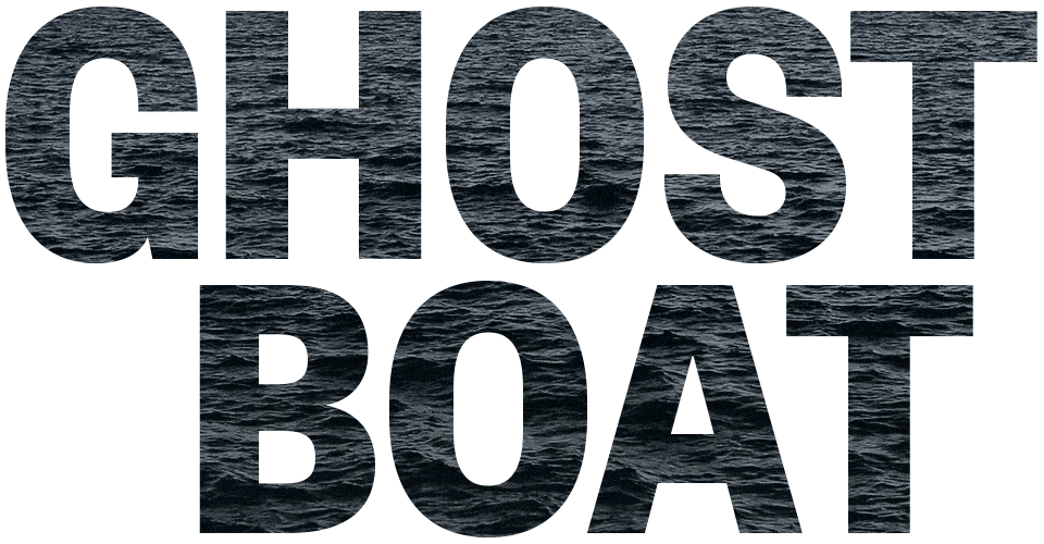
Ghost Boat — Medium
Ghost Boat, published on Medium, is nicely designed but it is worth including here not only because of how it looks but also because of how it was written. Medium set out to crowdsource the investigation into a missing ship carrying 243 migrants. The effort included many individual contributors as well as group hackathons, where teams tried to surface new evidence.
Exodus — Washington Post
Giant photos and maps welcome the reader through a multipage slideshow before this long piece begins. It traces the journey of one Syrian family’s trip to Europe. Other parts of the series used data to extrapolate out from this one family and give a larger picture of people’s movements and migrations.
Rape on the Night Shift — Reveal / Center for Investigative Reporting
Read. Watch. Listen. Those are the invitations at the beginning of this investigation from CIR’s Reveal and PBS’s Frontline. The story unfolds via an online article, a TV series and a podcast, each giving the audience a different look at the sexual violence perpetrated against immigrant workers. Original artwork, short videos and text are woven together in each part of the story.
Where Would 10.8 Million Displaced Syrians Fit? — Al Jazeera America
First created in 2013 but updated in 2015 during the refugee crisis in Europe and the ensuing debates here in the US, Al Jazeera tries to put the scale of the Syrian migration using population data from US cities. The project then allowed people to submit snapshots of their own area with comments reflecting on the crisis.
GOVERNMENT ACCOUNTABILITY
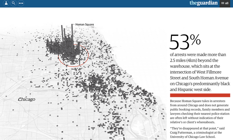
Homan Square: A Portrait of Chicago’s Detainees — The Guardian
Spencer Ackerman and Zach Stafford’s groundbreaking report on a secret interrogation facility in Chicago where at least 3,500 Americans have been detained is harrowing enough on its own. But the Guardian also created an interactive feature that provides individual details of many of the detainees and a number of video interviews where former detainees talk about abuse inside the building.
The Drone Papers — The Intercept
One of the most detailed looks at the US Drone program we’ve ever seen came from a cache of documents leaked to the Intercept. Weaving together source documents, photographs and animations that spill off the edges of the screen this series gives the you the feel of flipping through the files yourself.
The Demolition of Worker’s Comp — ProPublica
The poignant original illustrations that ProPublica commissioned for this piece are powerful enough, but then, when paired with interactive data visualization and photography, the piece drives home the struggle and the injustice people who are injured on the job often face.
The Making of a Narco-Terrorist — ProPublica
Using original illustrations and an interactive site that feels like a card game, ProPublica raises questions about sting operations carried out by the Drug Enforcement Administration and the agency’s claims that drug smugglers are funding terror. This project stood out for us because it is encouraging to see the use of hand-made illustrations in journalism as a way to guide a reader into the story similar to the way comics have done so for ages.
Missed Signs. Fatal Consequences — Austin American Statesman
In a massive three-part series, journalists at the Austin American Statesman create a damning narrative about the state of child protective services in Texas. Weaving together original source documents, data, photos and video the heartbreaking series covers the story from many different angles. What makes this project especially compelling is the Stateman’s use of sidebars that include comments and photos from its Facebook community.
CRIMINAL JUSTICE AND POLICE
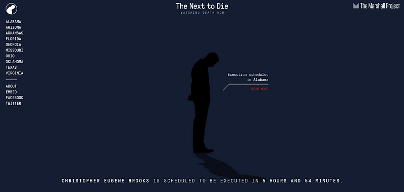
The Next to Die — The Marshall Project
If you want to know who is on death row and next to be executed, this Marshall Project presentation keeps a visual timeline of each death and the statistics in each state currently practicing the death penalty. It’s grim, it’s up-to-the-date, and takes data journalism to a new dimension. The project uses data and reporting from local partners around the country.
More than 900 people have been fatally shot by police officers in 2015 — Washington Post
There was no one source of data on police shootings so the Washington Post built their own database from “news reports, public records, Internet databases and original reporting.” The result is an unprecedented shooting database where the body count links to tiny profiles of each person who was killed.
The Counted — The Guardian
The Guardian launched their police shooting database about the same time as the Washington Post, but took a very different approach. Building off a few existing datasets, the Guardian turned to the community to help submit tips about police shootings. The project combines reporting with verified crowdsourced information (and you can see their methodology here).
The Empty Chair — New York Magazine
The story of Bill Cosby’s sexual assault allegations was one of the biggest stories of the year, and New York Magazine tackled the issue in a dramatic way: By putting each of his 35 accusers on the cover of the magazine with the exception of one empty chair. While the magazine’s print cover caught everyone’s attention upon release, the publication was even more impressive on the web where it told each of the women’s stories.
Unsolved — Journal Sentinel
Capitalizing on the crowdsourcing sleuthing fever that Serial started in 2014, the Journal Sentinel published this multimedia mystery series — paired with podcasts and videos — about a 14-year-old high school freshman who went missing in the suburbs of Milwaukee 40 years ago.
An Unbelievable Story of Rape — ProPublica / The Marshall Project
The story is about a young woman who was punished by police for reporting a rape they didn’t believe happen, one that was eventually proven true once the serial rapist was caught. But the story is also about two nonprofit news organizations coming together by mere happenstance as two investigative reporters sort of stumbled upon each other as they quietly looked into the same story.
(There is a lot of notable criminal justice reporting that happens at the local level and doesn’t get the attention it deserves. It may not be as flashy as others, but see these two pieces by the Daytona News Journal and Atlanta Journal Constitution)
THE ANNIVERSARY OF HURRICANE KATRINA
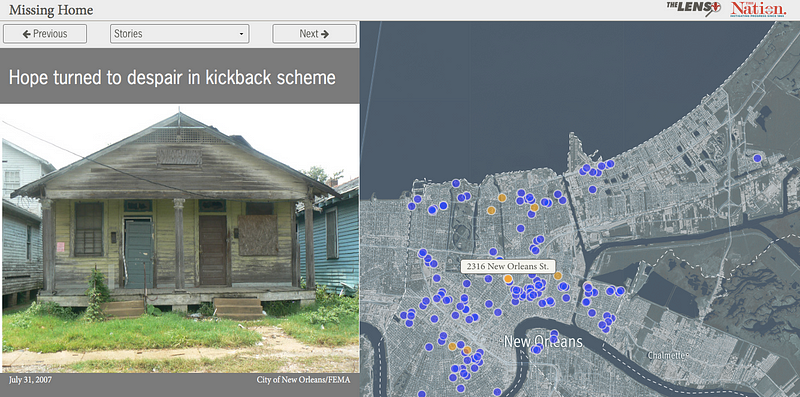
Missing Home: What We Demolished in New Orleans After Katrina — The Lens
They say you don’t know what you’ve got until it is gone. Through data, maps and photos the New Orleans-based nonprofit The Lens created this amazing database of all the homes that were demolished after Hurricane Katrina. And through the lens of these properties they told the stories of people who lost their homes.
The Re-Education of New Orleans — Education Week
On the tenth anniversary of Hurricane Katrina Education Week focused in on how schools have changed in the city since the storm. Building on personal stories, strong photos and revealing data the piece tells the story in the voice of the people most affected.
10 Years After Katrina — New York Times
The New York Times took a neighborhood approach to telling the story of Katrina’s anniversary by going back to some of the areas hardest hit by the flooding. With full screen videos and maps that compare flooded areas and demographic changes in the city, the Times tries to put a face on a city that is still in transition.
The Next Big One — Washington Post
This piece weaves together a lot of the elements we’ve come to expect from big online stories including video, maps and stunning photos. However, Washington Post’s coverage also included drone footage and a touching series of profiles of Katrina survivors ten years after the storm.
MISCELLANEOUS
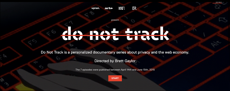
Do Not Track — Upian, AJ+, ONF, ARTE, Bayerischer Rundfunk, Tribeca and others
In many ways, Do Not Track epitomizes the kind of creative, interactive storytelling that could only be executed on the web. The makes of Do Not Track call it “a personalized documentary series” which adapts to the person watching it. People are invited to share their data with the project, and in return it will show you “what the web knows about you.” (See also this great report on journalism and online documentaries from MIT)
A New Whitney — New York Times
This piece on the new Whitney museum is a rollercoaster of visuals that zooms the reader high above the city and through the glass walls of the new building. (See also A Gift to New York, In Time for the Pope for another interesting architecture piece.)
A Clash in the Name of Care — Boston Globe
The Boston Globe Spotlight team, subjects of one of the 2015’s best movies, delivers a powerful piece of watchdog reporting on surgeons who conduct two procedures at once. The investigation includes a clever feature where names turn into buttons that pop-up background info about the person. The piece pulls together source documents, graphics and video into a powerful package.
The Presidential Election in Emoji — The Atlantic
In a year in which Oxford Dictionaries chose an emoji for it’s “word of the year” it seems only fitting that a news organization should mine the pulse of the American public through the emojis they use to discuss political candidates. The Atlantic’s tracking of emojis in tweets about the candidates is a fascinating look at both social media and shifts in political discourse.
The Life and Times of Strider Wolf — Boston Globe
It is just text and photos with a companion documentary, but it is still one the most heart wrenching and memorable stories from the past year.
Tapered Throne — Brandon Tauszik
Tauszik brings photojournalism to life through subtle and carefully crafted GIFs of Oakland’s black barbershops. The technique extends the emotion of the moment just enough to reveal little details in the motion that you might not get in a still image.
A Walk Through the Gallery: “Henri Matisse: The Cut-Outs” — New York Times
As you scroll down the Museum of Modern Art’s recent Matisse exhibit unfolds across the screen, as if you are walking down the hall staring at the artwork yourself.
Is the Nasdaq in Another Bubble? — Wall Street Journal
The Wall Street Journal turns the ups and downs of the stock market throughout history into a rollercoaster which readers can scroll through on the screen. As you watch you begin to feel the climbs and falls in a way that puts today’s stock market unrest into perspective.
World Bank Projects Leave a Trail of Misery Around the Globe — Huffington Post and ICIJ
In this multi-part investigation by the Huffington Post and ICIJ different episodes employ different tactics from data visualizations to videos. The reporting spans five countries, each with photos and data about the impact of World Bank Projects in those countries.
Social Reporting if Charlie Hebdo — Reported.ly
Reported.ly had just gotten staffed up and running when news broke of the massacre at the offices of the satirical newspaper Charlie Hebdo in Paris. In their coverage of those events they began to show the power and potential of their distributed social reporting approach. Be sure to read their debrief on the coverage.
What did we miss? Help us continue to shine a spotlight on great reporting by adding links and your thoughts in the comments. (We know this list is very US-centric, so we’d love to see more examples of non-US journalism and multilingual reporting.)
Follow us on Twitter @jcstearns and @rungomez and sign up for the Local Fix newsletter for more great examples of amazing journalism and tips for how to create your own.

